


As a Chicago resident, I have followed with great interest the steps local leaders have taken to improve the safety of bicyclists in my city. When I began bicycling more, I became interested in the effects the city’s protected bike lanes (PBLs) had on cycling overall and safety specifically in combination with the flexibility of bikeshare. This led to me conducting independent research on bike crash rates while completing my master’s degree in urban planning and policy at the University of Illinois at Chicago. But first, some backstory.
In 2011, Rahm Emanuel, who was then Chicago’s newly elected mayor, proposed adding 100 miles of PBLs by 2015 to get more people walking and biking. Central to meeting this goal was Chicago’s Streets for Cycling Plan 2020, released in 2012, which identified “a 645-mile network of on-street bikeways that will encourage all Chicagoans to ride their bikes.”
In a subsequent press release, the city claimed to have met its goal of installing 100 miles of PBLs by late 2015. However, others soon questioned this claim based on differing interpretations of what constitutes a PBL. But even these more questioning accounts acknowledged the city’s significant progress—more than any other US city at the time.
Chicago’s rapid progress on bike infrastructure would prove short-lived, however. Three factors slowed the city’s implementation program: so-called “bikelash,” funding, and equity concerns.
“Bikelash” manifested in the form of some residents objecting to proposed parking reductions on streets to accommodate the new bike lanes. Such opposition is common across cities and in some neighborhoods, as this piece in The Washington Post explains.
The second issue affecting progress was the city’s funding approach. For example, the city relied on funding from the Congestion Mitigation and Air Quality (CMAQ) Improvement Program, but this program limited the use of funds to improvements (meaning it could not pay for maintenance). Local funds often came out of each ward’s $1.3 million infrastructure budget, where bike improvements had to compete with residential street repaving, streetlights, and other basic upkeep.
Finally, a renewed focus on equity meant the city began to (correctly) prioritize community feedback and listening to residents’ wants, needs, and concerns about proposed projects before building them. This differed from the city’s previous top-down approach but has had the effect of slowing the rollout of PBLs.
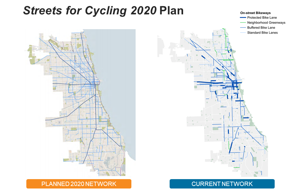
On the left is the planned 2020 network. The right shows the current network. Some of the network has been built out, but gaps remain.
By 2017, the city had also published Vision Zero Chicago, which was an action plan to eliminate traffic fatalities and serious injuries by 2026. Integral to the city’s plan was a new tool: Electronic Crash Reporting (ECR). Instead of receiving important crash data annually from the state, ECR allowed city agencies to receive daily reports that would help identify trends and needs to improve residents’ safety.
As a graduate student in 2019, I began looking at the data around bike crashes as part of my master’s project. Specifically, my research sought to answer two questions: 1) whether local control of bike infrastructure affected safety-related outcomes; and 2) whether the city’s new PBLs reduced bicyclist injuries and fatalities.
Using the before-and-after method described in the literature, one would expect to find a reduction in bike crashes after treatment when comparing the two. Similarly, but using a different method, in cases where count data was not available to compare the segment before and after treatment, one would expect a higher bike crash rate to be observed along control (non-PBL) segments.
One of the roadway segments I selected for a before-and-after method analysis was Dearborn Street in downtown Chicago. Dearborn Street now features a two-way PBL on a one-way street with two lanes for motor vehicles; the previous configuration featured three motor vehicle lanes and had no bike lanes at all.
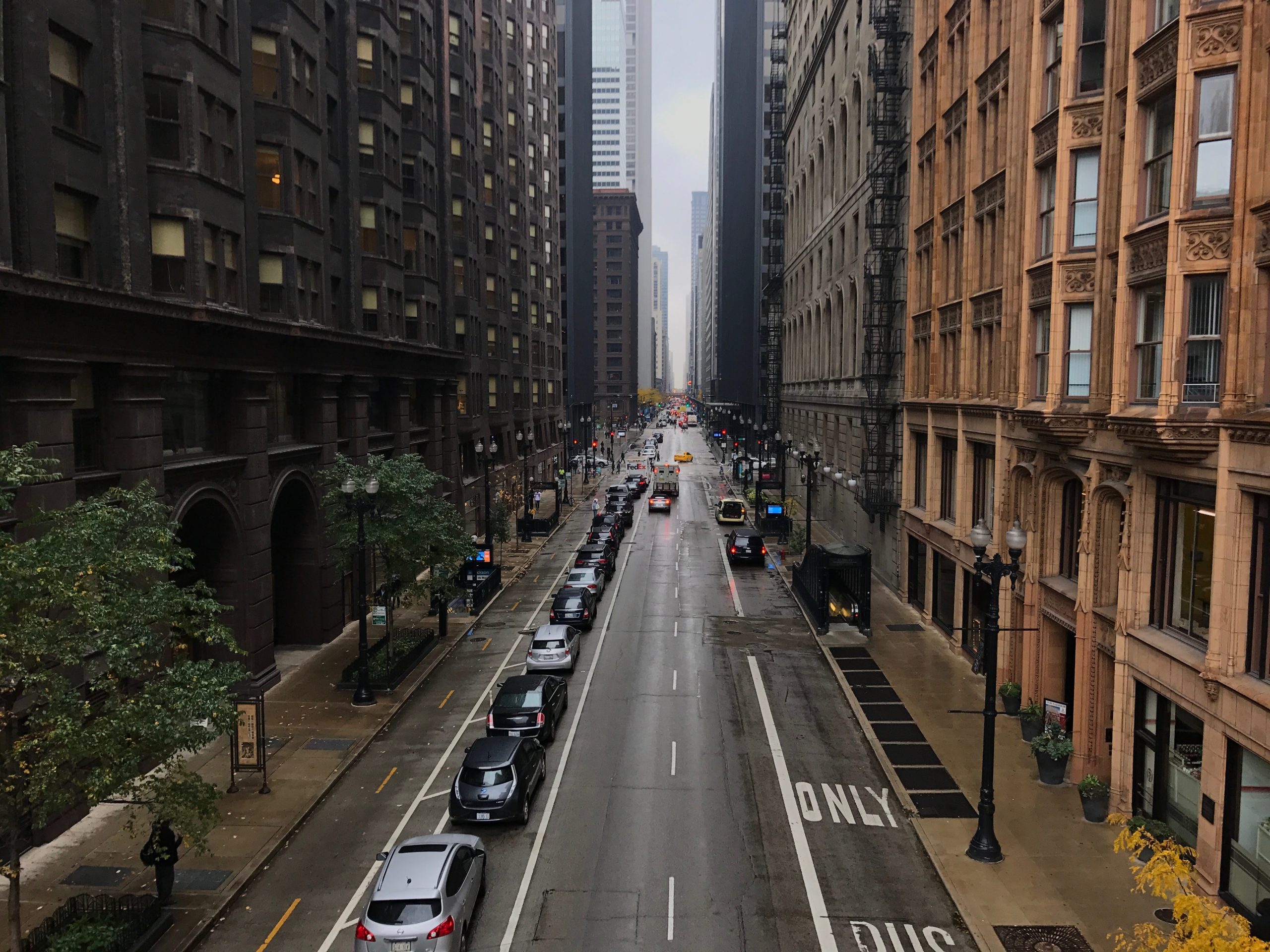
Dearborn Street shown in its current configuration with two lanes of one-way traffic and a two-way PBL.
To conduct my before-and-after analysis, I drew a buffer around Dearborn Street and compiled all available crash data for that segment. I then estimated the average daily bicycle count using data from the city’s downtown cordon counts, which showed ridership doubling between 2012 and 2015.
This allowed me to estimate the crash rate, which is the preferred measure since the total number of crashes does not consider how many more people are bicycling or the total number of bicycle kilometers traveled. Understanding the change in underlying ridership is important here because the PBL transformed how people moved across the downtown area on bikes.
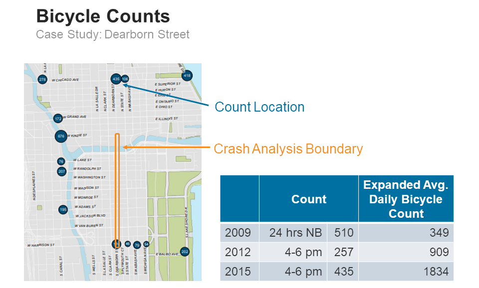
Chicago has cordon count locations. The nearest count location was a bit north of the PBL, and that location was a one-way street (as opposed to the two-way PBL on the Dearborn Street segment I focused on). For that reason, I would expect the expanded average daily bicycle count I came up with underestimates the number of bicyclists.
Based on my analysis of crash data and estimated average daily bicycle counts, my research found the crash rate for Dearborn Street decreased from 30.3 to 7.0 total bicycle crashes per million bicycle kilometers traveled. These findings were in line with some PBLs in New York City, according to the literature, which noted an overall crash rate of 2.3 bicycle crashes per million bicycle kilometers traveled along the 19 US cycle tracks studied.
Following my analysis and completion of my master’s project, I started looking for ways to turn my data into something more useful. R has been a great tool for me at RSG when processing large datasets like our household travel survey results, so I knew the language could help process this large quantity of crash data. I ended up trying out Shiny, an open-source RStudio package that turns analyses into interactive web applications, to visualize my findings.
Shiny helped me transform preprocessed crash data tagged to boundary polygons into interactive maps. This displays summarized crashes for a selection of boundaries and only shows the user data for the polygon they select.
I’m also currently working on adding demographics. This addition would allow the app’s users to normalize by population and see if there are disparate crash rates by race or income.
Key research takeaways
My research found that crashes involving people on bikes can increase following the creation of new bike infrastructure, particularly when that infrastructure is popular among users. That said, this increase can obscure significant improvements in the overall crash rate.
My research also revealed the need for more bike count data, especially before new bike infrastructure is installed to facilitate before-and-after comparisons. This data is invaluable to researchers when seeking to calculate crash rates along particular roadway corridors or segments and generate city-specific expansion factors.
Finally, visualizing these findings (using Shiny or a similar tool) allows for the identification of high-crash locations, which can aid planners in determining what additional bike infrastructure improvements may be needed.
······························
Michael McCarthy is an Analyst at RSG. You can demo the latest version of his interactive Shiny app by clicking here.